All articles 
Accessible forms in five steps
Forms are often the biggest hurdle on a website. With five rules, anyone can fill them in.
Mira Schulz · Development
1 min read
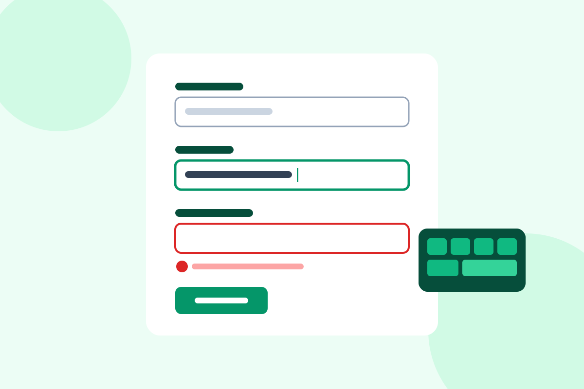
Contact forms, orders, sign-ups: forms are where visitors become customers. All the more annoying when they don’t work for everyone.
The five rules
- Visible labels – placeholder text inside the field isn’t enough, it disappears as you type.
- Mark required fields – and not with colour alone.
- Clear error messages – right next to the field and specific: “Please enter an email address” instead of “Invalid input”.
- Keyboard first – all fields and buttons must be reachable without a mouse.
- Matching field types – so phones show the right keyboard and autofill works.
Want an example?
Our own contact form follows all five rules. Give it a try – keyboard only, if you like.