All articles 
Getting dark mode right
Simply inverting the colours isn't enough. What makes a good dark design.
Jonas Weber · Design
1 min read
Contents
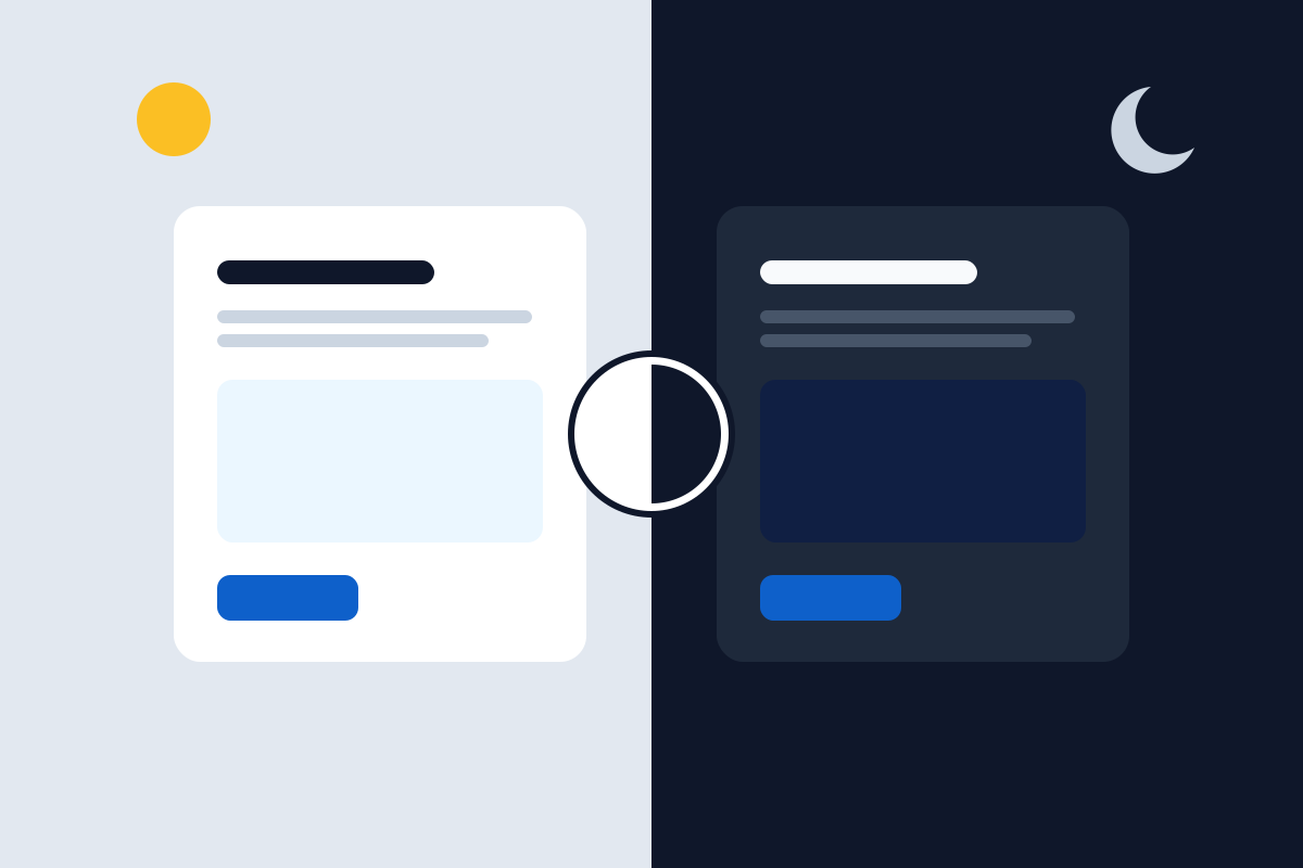
Many people use their devices in dark mode. A website that stays glaring white quickly feels dated. But careful: dark mode is more than inverted colours.
Not quite black
Pure black with pure white is tiring for the eyes. Very dark blues or greys and slightly muted text work better.
Check contrast again
Colours look different on a dark background. A blue that reads well on white can be too weak on dark. That’s why we check contrast in both modes.
Let people choose
On our own website you can switch at the top right – give it a try. Your choice is saved and applies on your next visit.